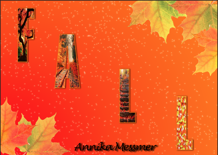
 I really enjoyed doing these and had a lot of fun creating my own postcards. Designing them as well as doing them to be what I think is best really helped me get in touch with my creative side. I really did that with my Christmas card because I didn't follow any tutorials and got a little inspiration from another postcard that I saw. I also think It is the best looking one. The other two postcards had a tutorial that I followed. For the fall one I used a tutorial to put the pictures in the letters using a clipping mask. For my personal postcard I used the knowledge from the fall card to make my name. However, the background was from a tutorial that I found online which used Gradients and Gradient Overlay. I also redid my logo because the one I had before looked awful and I didn't think it represented me. As for my brand i'm really not sure what it is. But I think I need to learn a bit more about what a brand is before I know what mine is.
Thursday, December 11, 2014
Postcards
 I really enjoyed doing these and had a lot of fun creating my own postcards. Designing them as well as doing them to be what I think is best really helped me get in touch with my creative side. I really did that with my Christmas card because I didn't follow any tutorials and got a little inspiration from another postcard that I saw. I also think It is the best looking one. The other two postcards had a tutorial that I followed. For the fall one I used a tutorial to put the pictures in the letters using a clipping mask. For my personal postcard I used the knowledge from the fall card to make my name. However, the background was from a tutorial that I found online which used Gradients and Gradient Overlay. I also redid my logo because the one I had before looked awful and I didn't think it represented me. As for my brand i'm really not sure what it is. But I think I need to learn a bit more about what a brand is before I know what mine is.
Saturday, December 6, 2014
Serpent Character
My character is a serpent creature. I designed her this way because I though it would look cool.
The tail was a bit of an issue in thinking of how i would make it move across the screen. I didn't really have any issues with the key frames except figuring out how to move the body from one side of the screen to the other. When creating the key frames for the tail I positioned it how I wanted using the puppet tool and put in a key frame. I positioned the tail every second. Since I didn't have to time each step it was a lot easier to animate.
I learned how to use the puppet tool to make the tail wiggle and I learned how to use the puppet starch tool to make part of the tail stiff. And again thinking of how the tail would move the body across was kind of an issue. If I could redo anything I would make it slower. But I feel that I did ok considering i'm new to animation.
Subscribe to:
Comments (Atom)


