Wednesday, May 17, 2017

Final Graphic Design Reflection

Technology
One of the most valuable takeaways that I’ve learned while in Graphic Design is technology. When I first came into the Graphic Design strand my sophomore year I had never even used an Apple computer. I had no idea how to use anything and had to ask my friend how to do the simplest of things like getting onto the internet and moving around folders. But by the end of my sophomore year, through practice and usage I got the hang of just using the computer.

I also learned how to use industry programs, Photoshop, Illustrator and InDesign, mostly through just using the programs over and over. I learned the basics of Photoshop first, learning mainly from online tutorials, and spent little time in Illustrator. So for a while I wanted to do every thing in Photoshop and almost hated Illustrator. But after continuous use of Illustrator in my junior and senior year Illustrator has become my favorite program to use! At the moment I’m still a bit iffy in InDesign, but I’ve defiantly learned a lot more about it this year. The last project I did this year, our non-for-profit brochures, really helped me get more comfortable with InDesign. Working with grids, columns, and just how to work with the different tools was a great learning experience for me. I’ll try to use it more in the future, but my go to program is still Illustrator.
This skill I’ve acquired over the past three years is truly important to me, because I would never be where I am today without learning how to use the programs of the Graphic Design industry! My knowledge of the programs has helped me in every project I’ve done.

Collaboration
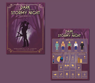
            Another valuable takeaway I’ve learned is collaboration. I’ve learned this through projects I’ve done in groups like our Homecoming project. This was where we chose a partner to create a poster, tickets and infographic for my schools homecoming. My and my friend Katie split up the work between us, she doing the poster and tickets and me the infographic. While doing this project we had to collaborate and make sure the designs we were making fit together and felt like they belonged together.
            This aspect is important because there will always be projects where I have to collaborate with 1 or more people and learning how to work with different types of people is defiantly a needed skill.

Leadership
            Leadership is another great takeaway that will follow me through out my Graphic Design career. While I am not the type to automatically take on a leadership role, I only do when no one else will, I have learned its importance. Someone has to take charge whether it’s a group of two or a group of 20.

Communication
            Communication is also really important, but something I’ve struggled with. When I started in this program I barley asked any one for feedback. As I progressed I started getting more comfortable and feeling better about the work I was putting out. So I started asking for feedback more, but only from my friends/Katie. I know I need to communicate with more people and that is one of my main goals as I go on to college and beyond.
This aspect is important because I not only need to communicate with the people and peers around me, but also in my designs.

Project Management
            From the start I have developed more and more project management skills. I know I’ve struggled with this some, especially in my homecoming project, but I think I’ve gotten better about managing my time. I learned how to manage my time by juggling multiple projects at the same time, class projects and client work.
          This takeaway is really important because every project I do will have deadlines and it’s important to be able to get them done on time. As well as allowing your self time to get your designs in a good spot for the deadline.

Strengths/Weakness
            I think the greatest strength I have gained this year is to push myself or determination. I knew that I didn’t do any outside of class projects my junior year, besides e-magine, so this year I tried to take on as many projects as I could. This resulted in a decent amount of time spent after school and in seminar working on projects like my real estate business card and the Christmas slides I did for my church, which I loved to do. One of my greatest weaknesses is communication. I really need to get out of my little bubble of people to ask fro feedback and get more opinions and views of my work.

Future

            After I graduate from high school and the Graphic Design strand I will be attending The University of Kansas and major in Graphic Design. And I plan on taking everything I’ve learned in this program with me. I plan on using everything I’ve learned about technology, collaboration, communication, project management, and leadership and apply it in every project I do to become the best Graphic Designer I can be.


Change
             In all honesty I don’t think I would change a thing. The mistakes I’ve made have made me who I am to day and I’ve learned from them. Without blunders and slip-ups I don’t think I would have learned as much as I have.  Mistakes and regrets are going to happen whether I like it or not, so I might as well learn from them. Like how to get a project done on time and use the time I’m given wisely. One of the reasons errors are there is to learn from them.


Conclusion

            From all my time in e-Comm I really cherish the relationships I’ve made. My friendship with my future roommate Katie, getting to be taught be a wonderful teacher, and getting to communicate with other Graphic Designers like Laura Berglund and Tyler Galloway. Whenever I start a project I never think about how long it will take. When I started to log my hours for endorsement I realized how long one project could take. I could spend 15-20 hours making a logo and business card. It all adds up: sketches, concepts, final concepts, revisions and final tweaks. All of this has been a blast and I will defiantly remember my time here fondly.

Friday, December 16, 2016

Graphic Design Reflection Final

1.)
Homecoming
For this project my class was put into pairs and created a homecoming poster, tickets, and infographic. One person worked on the poster and tickets while the other did the infographic. We worked on this for a few weeks. A challenge we faced during that time was lack of communication between us and the committee as well as meeting deadlines. The theme was questioned through out the entire project. It was originally given to us as a homey, cosy vibe on a dark and stormy night, but it was shaped by the committee to be a more spooky night theme. Even this was heard through friends of some people in the class and wasn't given to us directly. And while the end deadline was met the milestones were not. Along the way I learned a lot about infographics, what goes into them and how the should be layout. This being one of the first times i've really done an infographic I got a lot of feedback, like making it more graphic centers and adding a graph/survey which I did add. Overall I thought I could have done more to research infographics and I could have done more to meet milestones.

Rebrand
For this project we were to take a preexisting company with a bad logo and redesign it. This took roughly three weeks. A challenge faced was getting my logo and type to match and feel complementary. I learned more about product design and had a lot of fun coming up with and interesting shape to place on my bottle. Along the way I learned more about the research that goes into the design, mainly researching the company as well as what needs to go on the final product. I was given feedback on fine tuning the six designs and really getting them in a great spot, and I adjusted them accordingly, messing around with font and placement. Overall I am happy with the final product and had a fun time through out each part of the design process.

Outside Class Projects


This year, for experience and e-hours, I did quite a few outside projects. I created a logo and business card for Jennifer Brule, a real-estate agent who worked for Reese Nicholes. I created two t-shirt designs for seniors and Student Naturalist, the latter of which was used and manufactured. I also entered a quick design for the ONW Hall of Fame and some button design for the week of caring. For my church's children Sunday school I created 8 Christmas slides, one main, on blank, four lesson, and two memory verse, as well as an Advent calendar handout.

2.)
While at times i can get a little distracted in class I think overall I stayed on task and productive. I haven't really finished a project early or thought I did and sen time refining my designs as much as I could until the deadline. I also did quite a bit of outside class work for other clients as well as working on class assignments after school. I come in after school to work as well as during some Seminars and at home.

3/4.)
I think my strongest areas are my sketches, and feedback. I really feel like I can give good feedback and enjoy the critiques we do in class, both giving and receiving advise. I also enjoy doing initial sketches and they are pretty clean and understandable. I could maximize my strengths by getting and giving feedback outside of critiques and not just from my neighbor. I could also go beyond by doing more sketches than asked of me. I think my weakest area is communication.  I tend to stick to asking my friend for advise and need to get out of my comfort zone and get more feedback from others. I could improve this by going around to other people and asking for feedback and conversing more.

5.)
Overall I had a lot of fun with logo design and actually loved doing all the outside of class projects, and seeing them out on t-shirts or in Sunday school it feel really rewarding. I would do more to communicate with more people and spend more time researching and this will be my goal for next semester. I did learn a lot about infographics and enjoyed doing so.

Friday, September 16, 2016

Dark and Stormy Night, Homecoming 2016

             For Homecoming we had to create a poster, infographic and tickets that fit the theme of dark and stormy night. We were put into groups of two, one worked on the infographic, and the other the poster and tickets. I did the infographic, however we both started out by sketching 20 poster designs and presented them to each other. After choosing two posters to push on the computer I started to work on layout ideas for the infographic. I researched different designs and layouts to see what worked well, and then sketched out several ideas. After that I pushed my concept on to the computer in Illustrator. Though, after a few critics, our group and another group merged our infographics/posters, creating a more icon focused infographic. Then we both kind of unmerged and made two separate posters. I also did a lot of tweaking to it, adding strokes, and graphs. When we were finally done we sent our posters and tickets off to print. Once they came back we cut them out and mounted them on matte board.

            Along the way I learned a lot about infographics and a bit more about Illustrator. I learned basic layouts of infographics and that they are meant to be icon heavy and can carry more info than given, like survey graphs and strokes. I also learned that Illustrator added two new features, rounded edge marks, and a tool where you can create shapes, like circles, and rectangles, and delete shapes in shapes and I learned how to make a clipping mask, command7, which I used for the gold foil. For what I would do differently I would have started earlier on my infographic and researched a little more. But I do like how our group and another merged at one point, it really helped me get more perspective on the infographic.


            I would take what I’ve learned in Illustrator, tools and short-cuts, as well as infographic layouts and incorporate them into future projects. Overall I enjoyed this project, even though I got kind of done with closer to the end.


Wednesday, December 16, 2015

Gestalt Principles

Similarity
www.andyrutledge.com/gestalt-principles-2-similarity.php


   This article was about the Gestalt Principle of similarity and different ways we perceive
similarity as well as how this can be applied to web design. The author states that shape,
size and color are fundamentals of this principal which can then be applied to links, page
content, and organization in web design. Similar shapes will seem to be linked even when
 jumbled around with others. The same goes for color and size. The articles' strength lies in
 its' usage of images which help the reader visualize the similarities. It also has strong
organization which is used by heading separate paragraphs with question to tie the paragraph
 to the picture. However, the author concludes with saying that this principle is simple but it is
 ok for a design to be complex.


Continuation
http://blog.templatemonster.com/2012/04/19/gestalt-continuity-law-templatemonster-templates/

   This article is about how continuity can be applied and how it works in our minds. It talks
 about how our mind continues pattern seen even if the pattern physical ends. Like how we
 might see four coverging lines instead of two lines that intersect if each part were colored
 different. Another way continuation works is when we see items placed in a row our minds
tend to group them together. Placing certain items a bit to the right causes our minds to see
 them as subheadings. We also follow objects that guide us to a certain spot. For example, if
 there was a picture of someone looking to the right you would look to the right.  Or if someone
 is pointing you would look where they point.


Closure
http://www.andyrutledge.com/closure.php

    This article relates closure to more than just design. It is used to create a hole picture that makes sense even if it's not there. The article uses the example of Patton's fake army. A German general put an enormous army at Calais to defend against an army that wasn't coming. He had gotten bits of information which he put together in order to make sense of them. However, instead of the enemy attacking at Calais they attacked at Normandy. This is an example of closure in a situation in design it can be used to create an entire image in our head or give simple snapshots motion.

Proximity
http://www.andyrutledge.com/gestalt-principles-3.php

   Proximity, uniform connectedness, and good continuation are essential for written communication. Without these a paragraph would be just random words on a page. Proximity helps us discern if certain things are in a group/together or not. If dots, like in the article, are placed close together then we perceive them as a group. While if they are farther apart they are separate groups. Even when the principle of similarity is put in to play if the dots are apart they are separated. An even stronger way to make connections is through uniform connectedness. For example, images or things in a box or connected by a line would immediately be seen as together. If elements are on a line or a curve then we relate them to each other. This would be the principle of good continuation being put in to effect. This principle is useful in a graph, grid or chart.

Figure/Ground
http://www.andyrutledge.com/gestalt-principles-1-figure-ground-relationship.php

   The principle of figure/ground is where we distinguish what is background and what is figure. This principle also helps us see an object or image as 2-dimentional or 3-demantional. Like a blurred image would be seen as a background or an image or graphic with added shadows and highlights would be seen as figure. Figure and ground can also become interactive with each other, a good example would be Veerle Pieters' Duoh! website where the cursor can interact with the graphics changing them from ground to figure and vise versa.

Common Fate
http://www.andyrutledge.com/common-fate.php

   The principle of common fate is where we relate things moving in the same direction and find them more relatable than things that are not moving. We can see this principle in real life like cars driving on the highway. All cars are moving in the same direction at roughly the same speed, but if a car changes lanes or another car gets on the highway it catches our eye and we can respond to it. In the world of design this could be as obvious as a slide-out menu or bar. We take notice of that movement as respond to it. It could be interpreted in a less obvious way in complete works of design and how the elements and pieces work together or "move" in the same "direction".