The top one is Illustrator and the one below it is Photoshop. I found that I like Photoshop better and easier than Illustrator. The shadow on the ball is a lot darker on the Illustrator ball and the shadow of the ball is outlined a bit more in Photoshop. The highlights are about the same, but the values are softer in Photoshop and darker in Illustrator.
Wednesday, October 22, 2014
Tuesday, October 7, 2014
Logo Design
Sunday, October 5, 2014
Name
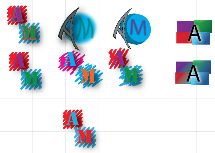
In this tutorial I learned how to put more than one fill on an object. I think I did really well following the instructions and understanding them. I would try putting more fills and experimenting with them if I were to do it again. I would want to learn more about how to make different and awesome looking gradients.
Wednesday, October 1, 2014
Mickey
In this scene Mickey is walking through a mirror which in our world would be impossible because mirrors are solid. It's possible because when you look in a mirror it seems like you can walk through it. It looks to be real because they give the mirror a plastic feel to it making it probable for Mickey to walk through it.
Here we see Mickey has gotten very large from sting a walnut. In the real world this is impossible because we don't instantly grow to the hight of a room by eating a walnut. Its possible because he ate a magical walnut. It seems possible because even though it's impossible to grow that quickly Mickey does because of the walnut he ate.
Then Mickey shrunken after being really big. This is impossible in our world because you can't just instantly shrink. It's possible because we see him shrinking. It looks real because even though it's impossible to shrink Mickey does because of a magical walnut.
In this scene we see Mickey fighting against a king if hearts card. This is impossible because cards are inanimate objects. It's possible because the card has human on it so it would move like a human. It seems possible because even though it's an in animate object it looks human so it has human movements.
Finally we have Mickey using a fountain pen as a squirt gun. This is impossible because a fountain pen doesn't have that kind of squirting power. It's possible because a fountain pen can squirt a little ink. It looks real because even though a fountain pen doesn't squirt a lot of ink in the animation world it's exaggerated.
Finally we have Mickey using a fountain pen as a squirt gun. This is impossible because a fountain pen doesn't have that kind of squirting power. It's possible because a fountain pen can squirt a little ink. It looks real because even though a fountain pen doesn't squirt a lot of ink in the animation world it's exaggerated.
Subscribe to:
Comments (Atom)


