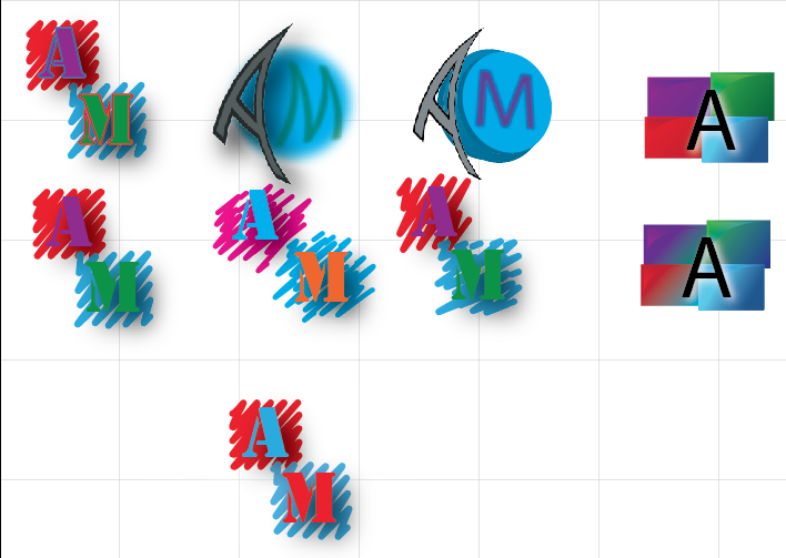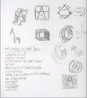


For my logo I used the shape of a square to represent progress. I used squiggles to represent my childish and artful side. The font I used is Stencil and I chose it because i thought it looked best on the square. I decided to used red and blue contrast colors because I like that contrast. Also blue used to be my favorite color, now my favorite color is red. During this project I learned how to make a drop shadow and squiggles in Illustrator. I also learned how to make 3D shapes, give an object perspective and curve an object, all done in Illustrator. I started making my logo by sketching some ideas that came to my head in my sketchbook and making the ones I liked in Illustrator. Once I did that I made an art board, testing out different variations of them. Then I picked the one I liked and thought would be the best. I think I did best on making the letters look like they'er floating by add in a drop shadow. But I if I could I would go back and apply at least one font effect to the text. I it would make it pop out more and bring a little more attention to the letters. But I need to work on experimenting because i really didn't do a lot of it when i needed to.
I like your design! It reflects a nice sense of creativity, even though the colors my be your favorites, they may not convey the message you are trying to send exactly. I get a creative feel from the design, but the colors seem a little off-put to what you are trying to show. Beyond that, I love the scribble shape you have in the back! have you tried having them go in different directions towards each other? that may look cool! In terms f usage, perhaps in you could use a mask to restrict the drop shadow to the scribbles and keep it off of the negative space, that would look better in use.
ReplyDeletebeyond that, I like the aesthetics of it! Good job!