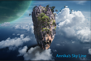
In my animation there is a girl on a mars like planet being chased by a big black dog and to get away from the dog she jumps into the water.
When I first thought of this it was actually just the girl running then jumping into the water but then I needed to add a plot so I added the dog so there was a problem and a solution. Before I added the dog I had already plotted out the scenes in a storyboard. One of her running through my multiplane background, which I had already made in a previous project. Then a worms eye view shot of her jumping off the cliff and after that a side view of her falling into the water. Finally, I added the dog to the scenes. I drew my characters and scanned them in. To give them color and shadows I used Photoshop. After that I put them in After Effects and put the anchor point in place. Then I added the key frames and rotation key frames to make the running scene. Which took forever! Then I added the the backgrounds that I made in Photoshop as well as the other views of the characters and put in their key frames. I also put in a splash that I had to move around a bit. Finally I went back through it and made little adjustments to my animation like making the characters in the running scene bounce when they run.
While working on this animation I learned a few things. I learned how the tabs at the top of the view work and what they do. I also learned about meeting deadlines and how you should try to spread out your focus so you don't spend forever on one single thing.
If I had to do this again I would change the dog into a dark cloud or something for a few reasons. One it would be sooooo much easier to animate not to mention it would probably look a lot better and two it would be a bit easier to draw and color. If I could keep something the same it would be the background and girl because I like the way they look and how I made them.
I will use what I've learned during this animation by spreading out my focus and planning things all the way through to make sure I like what i'm going to get. But overall I think I did an ok job even though I would change a few things about it. This was pretty fun to do even if it was a bit frustrating at times.


