Thursday, May 21, 2015

Hot Wheels Box

For this project we worked in teams, in my case it was Allyson and I. We didn't really have a leader and worked more like a team. So before we started the project we went over traits that make a good team which were trust, respect, and open communication, I think we displayed these well. We then came up with an idea for Hot Wheels where we had different race tracks on the boxes and the would link up with each other to make one long track. We had some trouble finding the right template but we eventually found one that was close enough but it cost money so we just redid it as best we could.

While I really think our idea was amazing we didn't have much of a plan for what we wanted the tracks to look like. Which ended in us pretty much slapping on a track like road but I also think it was because we were pressed for time. We also, although a bit later in the project, thought " hey, we should probably have the name somewhere on the box. So, again being short on time, ended up sticking the logo, that Allyson had accurately recreated, somewhere on the template.
 Also in our idea making process we decided to have the choking hazard warning on the inside of the box as well as all seven of the box designs so you could "catch 'em all" but as we were stressed for time we couldn't make seven different designs. At first we were not sure if we could have the printing company print on both sides but when we got them they did so that was a plus.


I think the most challenging part of making this was the designs. We hardly planned any of the designs so it came out looking that way too. There also wasn't a lot consistency through out the designs we had made. For example, the Hot Wheels logo isn't on the finish template and where it's placed on the other two are different, the tracks also looked a bit different. Those are also a few thing I would change or go back and fix. However, I did like the way the logo turned out as well as the checkered board and the cone in the picture bellow even if I didn't get to print it.
Later in the project we decided that it would be cool to have stickers, so people could customize their tracks, but they didn't turn out very well and I didn't have enough time to finish them. Overall, I think this project could have turned out a lot better and a bit grander if we had done more planning and had a lot more time.

Friday, May 8, 2015

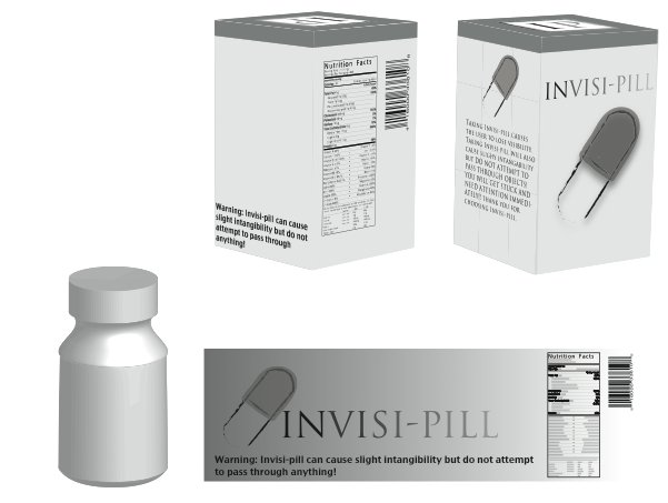
Invisi-Pill

 I started by making my template using the tutorial on Linda.com, making a die cut and bleed area. Then I added the basic colors I wanted to use and made the logo in a different document. After that, I it in the template and went online to get the nutritional facts and bar code. To get them in to Illusistrator, I imported them as vectors. Then I typed the warning and description along with the color bars and the top flap thing.

 For the label I also used a similar tutorial from Linda.com. I used a gradient from dark to light on the background and title to make it seem like it's fading away. I also put in the same nutrition facts, bar code, warning, title, and logo.
 Once I finished the template and label, I made the 3D mockups with the tutorial from Linda.com. I did it by making an outline of the bottle with the pen tool, then going to effect, 3D, 3D revolve to make the bottle. To make the box, I created a rectangle and then went to effect, 3D, 3D Extrude and Bevel. To get the panel art on the box I made each of the panles of the template into symbols and then went to map art to insert them onto the 3D box. I had the most trouble getting the label on the bottle, because no matter what I did, it wouldn't show up on the bottle.
 To fix the label problem I decided to just go with my logo and hope it showed up and it did. I turned out a little weird but I just went with it because I was sooooo feed up with the bottle.

Monday, April 20, 2015

E-Magine

   I had a lot of fun at E-Magine with my friend Anna in the white dress. I really liked a lot of the entries but I thought that some of them should have gotten first place instead. I also liked the concessions afterwards. My favorite one out of the video entries was Void and Dreaming of a Christmas Vacation. For the Graphic Design entries my favorite was Girl in the Woods and the motorcycle, which I think should have gotten first place. One of my favorites from Animation is the dragon and the watch. So over all it was a nice experience and it let me see what kind of projects are entered so I can plan for next year.


Sunday, March 8, 2015

Tangled Up In Saul Bass

Base
To start making this poster I started off with a saturated yellow back ground and the title in Hitchcock font which I got from the internet. I then made the base of the sun with a polygon. To make the sun rays I used the pen tool.


Experimentation
Then I experimented a little bit with some gradients and I could not decide which one I wanted to do and I got a lot of feed back about it. After all that I realized that Saul Bass never used a gradient and I wanted in to be closer to his work so I got rid of all the gradients.


Sun Hair
After getting rid of the gradients I made the hair lines in the sun. I used the line tool to make them and did a bit of experimenting with where I put them and how many I put. But then I decided that having less lines and then I cleaned it up a bit.

More Sun
After deciding to not use a gradient I was got some advise from my neighbor and chose to go with different colored layers to represent sunshine. So to make the first layer I just copied the base of the sun and made it bigger. Then I chose a color and filled it with that color.
Even More Sun
After I made my first layer I made the other two by copying the layer I had previously made and making it bigger. Then I filled them with the same color but lighter.
Title When I made the title there was an arrow on the G so I customized it so it wouldn't.
Credits
To finish up my poster I added credits at the bottom in the same font as the title and same color as the background. The credit is the the directors of Tangled.

Friday, February 27, 2015

Custom Graphics Name


      To create this I typed my name in News Gothic MT then selected both and outlined them to make them shapes. Then I merged the i and the m as well as the M and A, after I edited the A using the direct select tool. Also using the direct select tool I edited the dot on the i and filled it with green.

Monday, February 9, 2015

Maya Tools

  After I created the polything I lighted it by going to rendering and adding 4 lights, 3 directional and 1 point light. I put 1 directional light in front which was my key light, 2 in the back which were my back lights, and 1 in the middle of the polything which was my fill light/point light. My key light is very bright and uses cast shadows. My fill light is less bright and doesn't cast shadows like my back lights which are the brightest.

  To make the hammer I used polygons then distorted them. For the hammer head I used the cut faces tool to make the claw and the extrude tool to make the head of the hammer. To make the handle I just went to control vertexes and moved the vertexes. Then I made the nail with 2 cylinders and pointed the bottom of one using vertexes.

  When making the ice cream I used a bump map called cloud. Then I edited it to make it look more like ice cream by changing various settings in cloud attributes. After I finished making everything I made a looped animation by setting a start key frame, turning it 360 degrees then setting another key frame. To make it a movie I rendered it out in Maya, changing the render settings a bit before hand, then rendered it out again in After Effects.
    To animate the balls I made I started by filling out a table with which key frames each ball started, ended, touched the ground, and when into the air by watching the videos we had made earlier. Once I had all the frames recorded I started animating in Maya. I went to each frame I had recorded an set a keyframe there while also moving whichever ball I was animating to about where it is in the video of the ball. To make sure the balls weren't bouncing in a really weird way I went to the graph editor which is in Window - Animation Editors and made all of the bottom points linear instead of curved.


   When making the cups I used NURBS, curve and revolve tool. NURBS create curves and surfaces in a shape. To create a cup I used the CV curve tool in the bottom left perspective and made half of an outline of a cup. Then I used the revolve tool to make it a surface.
In order to make the salt shaker I made a circle from the curves tab and went to control vertex to move the four corner points in. Then I duplicated it several times and moved them up and shrunk the top one a bit. I went to the surfaces tab and hit loft which made the body of my salt shaker. 


Tuesday, February 3, 2015

The Kerning Game


Kerning is the spacing between two letters which you can change to make words, sentences, and paragraphs look better.