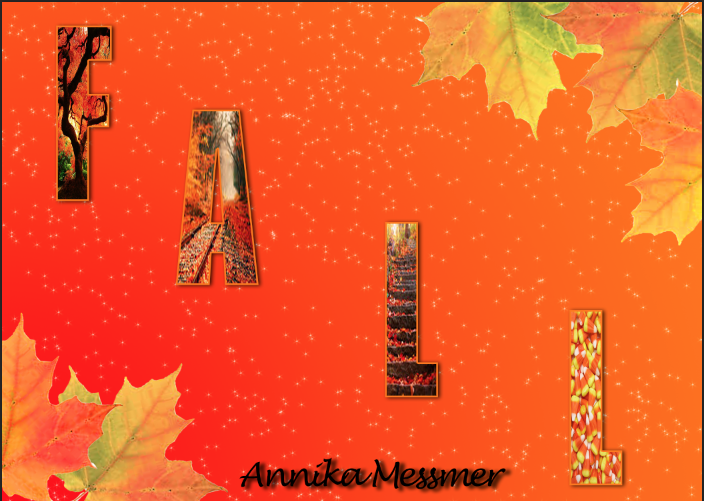
 I really enjoyed doing these and had a lot of fun creating my own postcards. Designing them as well as doing them to be what I think is best really helped me get in touch with my creative side. I really did that with my Christmas card because I didn't follow any tutorials and got a little inspiration from another postcard that I saw. I also think It is the best looking one. The other two postcards had a tutorial that I followed. For the fall one I used a tutorial to put the pictures in the letters using a clipping mask. For my personal postcard I used the knowledge from the fall card to make my name. However, the background was from a tutorial that I found online which used Gradients and Gradient Overlay. I also redid my logo because the one I had before looked awful and I didn't think it represented me. As for my brand i'm really not sure what it is. But I think I need to learn a bit more about what a brand is before I know what mine is.
Thursday, December 11, 2014
Postcards
 I really enjoyed doing these and had a lot of fun creating my own postcards. Designing them as well as doing them to be what I think is best really helped me get in touch with my creative side. I really did that with my Christmas card because I didn't follow any tutorials and got a little inspiration from another postcard that I saw. I also think It is the best looking one. The other two postcards had a tutorial that I followed. For the fall one I used a tutorial to put the pictures in the letters using a clipping mask. For my personal postcard I used the knowledge from the fall card to make my name. However, the background was from a tutorial that I found online which used Gradients and Gradient Overlay. I also redid my logo because the one I had before looked awful and I didn't think it represented me. As for my brand i'm really not sure what it is. But I think I need to learn a bit more about what a brand is before I know what mine is.
Saturday, December 6, 2014
Serpent Character
My character is a serpent creature. I designed her this way because I though it would look cool.
The tail was a bit of an issue in thinking of how i would make it move across the screen. I didn't really have any issues with the key frames except figuring out how to move the body from one side of the screen to the other. When creating the key frames for the tail I positioned it how I wanted using the puppet tool and put in a key frame. I positioned the tail every second. Since I didn't have to time each step it was a lot easier to animate.
I learned how to use the puppet tool to make the tail wiggle and I learned how to use the puppet starch tool to make part of the tail stiff. And again thinking of how the tail would move the body across was kind of an issue. If I could redo anything I would make it slower. But I feel that I did ok considering i'm new to animation.
Thursday, November 20, 2014
The Chase
In my animation there is a girl on a mars like planet being chased by a big black dog and to get away from the dog she jumps into the water.
When I first thought of this it was actually just the girl running then jumping into the water but then I needed to add a plot so I added the dog so there was a problem and a solution. Before I added the dog I had already plotted out the scenes in a storyboard. One of her running through my multiplane background, which I had already made in a previous project. Then a worms eye view shot of her jumping off the cliff and after that a side view of her falling into the water. Finally, I added the dog to the scenes. I drew my characters and scanned them in. To give them color and shadows I used Photoshop. After that I put them in After Effects and put the anchor point in place. Then I added the key frames and rotation key frames to make the running scene. Which took forever! Then I added the the backgrounds that I made in Photoshop as well as the other views of the characters and put in their key frames. I also put in a splash that I had to move around a bit. Finally I went back through it and made little adjustments to my animation like making the characters in the running scene bounce when they run.
While working on this animation I learned a few things. I learned how the tabs at the top of the view work and what they do. I also learned about meeting deadlines and how you should try to spread out your focus so you don't spend forever on one single thing.
If I had to do this again I would change the dog into a dark cloud or something for a few reasons. One it would be sooooo much easier to animate not to mention it would probably look a lot better and two it would be a bit easier to draw and color. If I could keep something the same it would be the background and girl because I like the way they look and how I made them.
I will use what I've learned during this animation by spreading out my focus and planning things all the way through to make sure I like what i'm going to get. But overall I think I did an ok job even though I would change a few things about it. This was pretty fun to do even if it was a bit frustrating at times.
Monday, November 10, 2014
Snail Shadow
In this tutorial I learned how to make a realistic shadow. First I chose an image, in my case a snail, then I selected it by using the magnetic marquee tool. After that I put it in the background of my choice, wood chips, by dragging and dropping. In order to make the shadow I followed the tutorial and made a layer copy. Then I used the transform tool and stretched it to take the form of a shadow. I made it a black to white translucent gradient to make it look like a shadow but since that didn't correspond with the background so I used the eyedropper tool to replace the white with a tannish color. Since the shadow didn't quite mach up with my snail I used the puppet warp to get it connected to my snail. Finally I used the burn tool to blend the background and snail together while adding a shadow as well.
Annika's Sky Line
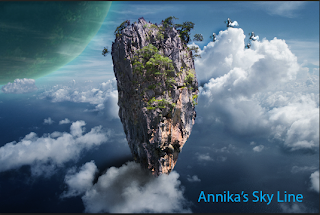
In this image there is a floating mountain in the sky with a large planet in the background. There is also a few pegasi in the background. I also added a light blue title in the corner of it.


I will use the skills I learned while making this floating mountain like the refine edge tool or lasso tool and put that into future work that I do. And overall making this was pretty easy and fun to do. I feel that I learned something very useful and I will probably use it a lot to get clean extractions.
I learned how to make it look like the mountain was behind the cloud in front by selecting the cloud with the lasso tool and hitting the refine edge tool. I also used this on the cloud in the back to the left so it was in front of the planet.
Friday, November 7, 2014
Creative Spheres
 http://design.tutsplus.com/articles/how-to-create-an-ultra-glossy-flaming-ball-in-adobe-illustrator--vector-6024
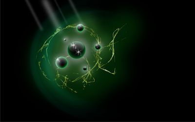
Spheres symbolizes nature and have a global or earthy feel to them. They also can symbolize controlled chaos but at the same time they can represent unity, perfection, wholeness, and completion. Which is cool and unique that it can represent two opposites.
As for my work process I start by scetching an ideas that come to my mind then narrow down the options to a few spheres. After that I go in to the program, Ps or Ai, and start bringing my scetches to life. While doing this I start experimenting a little by chafing around the colors or messing with the shape. Then I choose the one i like the beast and focus one that one until I finish it. Finally I save it to my file.
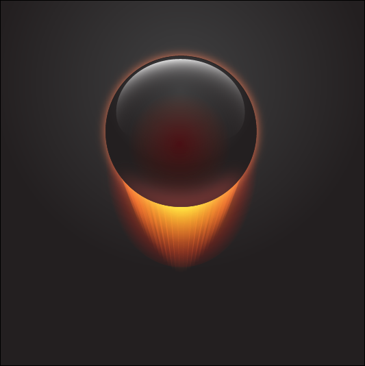 While making these spheres I noticed a few differences between Ps and Ai. Ps uses a bit map program, gradient overlap, and is a better use for photos. Ai uses fill and stroke, net layers, and to replaces gradients. In the Ps tutorial I learned how to use the gaussian blur to make it look like light is coming in. In the Ai tutorial I learned how to create a flame and use the blend tool. Both of these helped my understanding of each program a lot but I would like to learn more about creating a glow in Ps and softening a glow in Ai.
http://design.tutsplus.com/articles/how-to-create-an-ultra-glossy-flaming-ball-in-adobe-illustrator--vector-6024
Wednesday, October 22, 2014
Sphere
The top one is Illustrator and the one below it is Photoshop. I found that I like Photoshop better and easier than Illustrator. The shadow on the ball is a lot darker on the Illustrator ball and the shadow of the ball is outlined a bit more in Photoshop. The highlights are about the same, but the values are softer in Photoshop and darker in Illustrator.
Tuesday, October 7, 2014
Logo Design
Sunday, October 5, 2014
Name
In this tutorial I learned how to put more than one fill on an object. I think I did really well following the instructions and understanding them. I would try putting more fills and experimenting with them if I were to do it again. I would want to learn more about how to make different and awesome looking gradients.
Wednesday, October 1, 2014
Mickey
In this scene Mickey is walking through a mirror which in our world would be impossible because mirrors are solid. It's possible because when you look in a mirror it seems like you can walk through it. It looks to be real because they give the mirror a plastic feel to it making it probable for Mickey to walk through it.
Here we see Mickey has gotten very large from sting a walnut. In the real world this is impossible because we don't instantly grow to the hight of a room by eating a walnut. Its possible because he ate a magical walnut. It seems possible because even though it's impossible to grow that quickly Mickey does because of the walnut he ate.
Then Mickey shrunken after being really big. This is impossible in our world because you can't just instantly shrink. It's possible because we see him shrinking. It looks real because even though it's impossible to shrink Mickey does because of a magical walnut.
In this scene we see Mickey fighting against a king if hearts card. This is impossible because cards are inanimate objects. It's possible because the card has human on it so it would move like a human. It seems possible because even though it's an in animate object it looks human so it has human movements.
Finally we have Mickey using a fountain pen as a squirt gun. This is impossible because a fountain pen doesn't have that kind of squirting power. It's possible because a fountain pen can squirt a little ink. It looks real because even though a fountain pen doesn't squirt a lot of ink in the animation world it's exaggerated.
Finally we have Mickey using a fountain pen as a squirt gun. This is impossible because a fountain pen doesn't have that kind of squirting power. It's possible because a fountain pen can squirt a little ink. It looks real because even though a fountain pen doesn't squirt a lot of ink in the animation world it's exaggerated.
Wednesday, September 24, 2014
Google was called Back Rub but they changed it to make people think that their company could handle a lot of data that other search engines couldn't. So far their is no internet information on the origin or creator of the original google logo. It was updated in 1998 and the colors were switched and an exclamation point was added around in 1999.
Then they hired Ruth Kedar to modify the brand logo. Her first try she did'nt want to mess to much with the text. So she added a pattern between the two o's, with the colors used in the previous logo, to symbolize an infinite connection.
She then focused on one of the o's using an infinite pattern and adding a target. This was to show that the Google search engine was very precise an complicated but simple to use.
In the next version their was a shift in the typeface and layout. The circles overlap and join with a target to show the globally targeted nature of the business. But she though it looked to much like the olympics logo.
After that they tried adding a magnifying glass as one of the o's and a target in the other. They also changed the font to ITC Leawood. They added the Google colors as well. In another version of it they got ride of the target and put a smile in the magnifying glass.
In the last reiterations of the logo they switched up the colors and tried tilting one if the o's. They also added a touch of dimension and shading.
Multiplane
In this project I learned how to make different layers to create a multiplane and make a starry background in Photoshop. I also learned how to make it look like the things in the back are farther away when moving.
Wednesday, September 10, 2014
My Font
My font is Dot Matrix. It says Dot Matrix is someone who is emotional emotional, understanding, progressive, and relaxed. These relate to me because I like to express how i feel rather than using statistics. I think the best word is the one i hear. I am progressive and like to move forward. I am also relaxed, i don't try to discipline myself and go with the flow most of the time.
Worm
In this project I learned how to use the puppet warp tool. I also learned create a shadow that follows the worm across the screen. And I learned how to make the worm go from one side of the screen to the other side. I really enjoyed animating the worm with the puppet warp tool.
Friday, August 29, 2014
Pencil Project
I made all of these in Illustrator using tools like gradient, paint, shape, line, pencil, and stamp. At first trying to figure out all the tools was a bit frustrating but I got the hang of it. The first one was the simplest and easiest to make. It didn't take a lot of work and it was easy to follow the directions. The second and third ones were a bit harder and at first I couldn't figure out how to use the gradient tool. After getting some help it got easier and I found out new things about Illustrator. My three big take aways are that doing command j makes all selected pieces joined, the v key takes you to the select tool and command g/command shift g groups and ungroups.
Thursday, August 28, 2014
Bouncing Ball
To make a bouncing ball I first created a horizon, a ball
and a sky. Then I moved what I made into After Effects. I did this because the
key frames in After Affects let you do more with them, I just used Photoshop to
create the ball and background I was going to animate. Then added key frames to
make the ball move up and down across the screen and to make the ball squish
and stretch I adjusted the size of the ball when it was on the ground or in the
air. I also edited the key frames to make the ball ease in and out of the air.
This project was fairly easy but got frustrating at some points.
Friday, August 22, 2014
Graphic Design
Sunday, August 10, 2014
Subscribe to:
Comments (Atom)


