http://design.tutsplus.com/articles/how-to-create-an-ultra-glossy-flaming-ball-in-adobe-illustrator--vector-6024
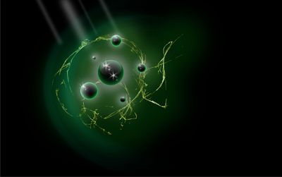
Spheres symbolizes nature and have a global or earthy feel to them. They also can symbolize controlled chaos but at the same time they can represent unity, perfection, wholeness, and completion. Which is cool and unique that it can represent two opposites.
As for my work process I start by scetching an ideas that come to my mind then narrow down the options to a few spheres. After that I go in to the program, Ps or Ai, and start bringing my scetches to life. While doing this I start experimenting a little by chafing around the colors or messing with the shape. Then I choose the one i like the beast and focus one that one until I finish it. Finally I save it to my file.

While making these spheres I noticed a few differences between Ps and Ai.
Ps uses a bit map program, gradient overlap, and is a better use for photos. Ai uses fill and stroke, net layers, and to replaces gradients. In the Ps tutorial I learned how to use the gaussian blur to make it look like light is coming in. In the Ai tutorial I learned how to create a flame and use the blend tool. Both of these helped my understanding of each program a lot but I would like to learn more about creating a glow in Ps and softening a glow in Ai.
http://design.tutsplus.com/articles/how-to-create-an-ultra-glossy-flaming-ball-in-adobe-illustrator--vector-6024


 Sun Hair
 Even More Sun
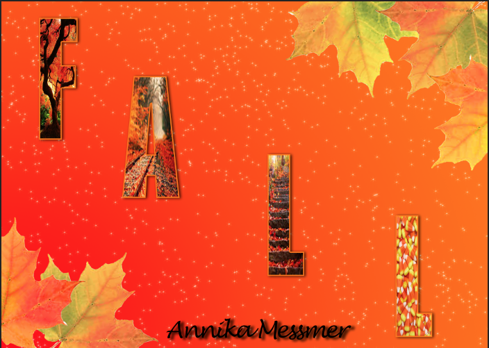
 To finish up my poster I added credits at the bottom in the same font as the title and same color as the background. The credit is the the directors of Tangled.